Once you've got your map built and you're happy with the layout, it's time to make it look pretty. There's a common misconception/meme that aesthetics are more important than gameplay, when in reality the two are not at all exclusive. While it's possible to add an aesthetic feature that can influence gameplay, avoiding such things really isn't very difficult. What is important however, is the fact that your aesthetic choices can actually enhance the gameplay of the map.
When a player is seeing a map for the first time, they will most likely be lost as they try and learn the layout of the map. As such, it's incredibly important to highlight key areas by giving them visual significance.
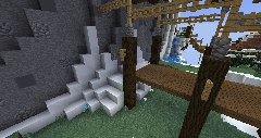 A bad example of visual hierarchy; this position is very powerful but is only a small pile of snow.
Design these key features from the perspective of a player walking around on the ground, to ensure that wherever a player is they can figure out where they are, via team colors and landmarks. In other fields, this is called wayfinding. Click here for a detailed analysis of effective wayfinding. Bad examples of this are obvious, like spawning inside a closed room with a choice between identical-looking hallways.
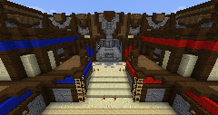 A good example of visual hierarchy; the platforms in both the front and back stand out and are distinct from each other.
Good examples can range from tall landmarks, giving separate areas distinct visual themes, and generally open views so long as line of sight considerations will allow. Objectives should especially stand out, and doing so can be as simple as an object floating far above marking its location. Don't over-detail unimportant areas (especially large flat walls), and ensure that the visual hierarchy matches the gameplay importantance of each area.
If this sounds too complex for you now, I suggest following these pieces of specific advice:- Make the walls and floor visually distinguishable.
- Edges and corners should stand out from the walls behind them.
- Disparate color changes should be an indicator of something when used.
- Cover and line of sight should be prioritized over whatever nice looking thing you could make.
- Team color should be visible at every point in the map.
- Important objectives should stand out visually.